Winter 2026 update post:
EACH PIXEL STANDARDIZATION
Winter 2026 is coming to an end. And with the season ending, it's time for a new update post. I need to do these posts regularly to show people (and myself) the results of the past months, that I and the game haven't been idle.
In this post I will talk about how the game characters were standardized, how I updated the game's main logo, as well as the start of writing the Design Document.
In this post I will talk about how the game characters were standardized, how I updated the game's main logo, as well as the start of writing the Design Document.
Characters designs.
I decided to start this year by fixing my previous flaws and redesigning the characters practically from scratch. These assets will be used directly in the game itself, and they needed to be high-quality and pleasing to the eye. This doesn't apply to the parts where I draw characters by hand for doodles.
Virusly hasn't changed much during this time, as his asset is already perfect. However, I did have to update his shading and palette a bit. The assets for his eyelid position were also completely redrawn.
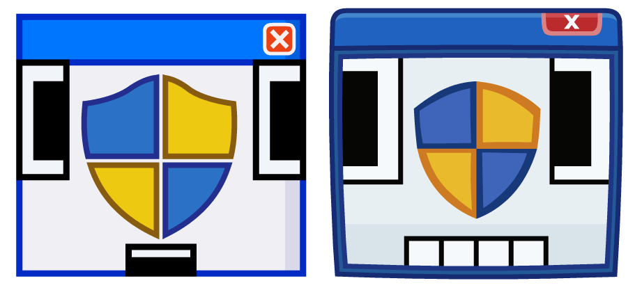
Openly has changed dramatically. He now matches the Lumirium design, has an outer frame, and no longer resembles the flash character like the older version.
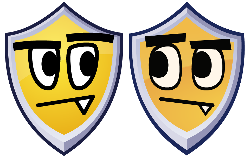
Antivirus S.U.L.T.A.N. didn't undergo any significant changes to his body, but he received completely updated facial assets. For example, his eyebrows were previously just a thick outline that could be deformed as desired. A simple bold line? Pfft. He needs to be more than that.
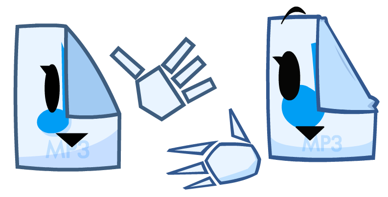
MP3sha has become an even more beautiful and detailed figure in the eyes of her fans. The main difference from the old assets are the completely updated sculpted hands. They are based on one of the old MP3sha fan art pieces, and I think they look absolutely stunning compared to the old ones.
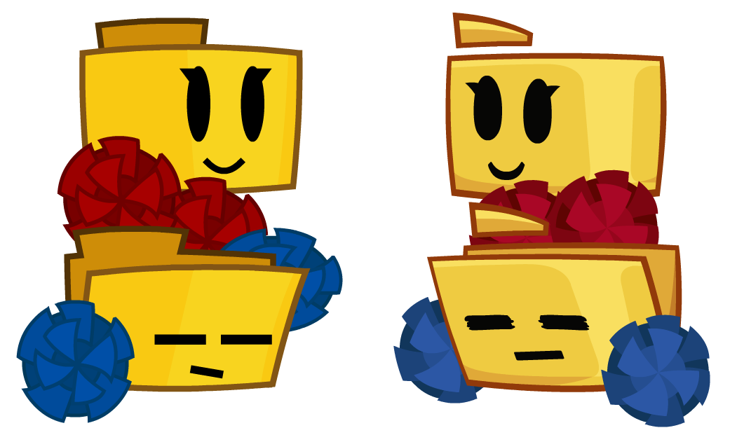
Unnamed Folders were completely redesigned from scratch due to the folder design changes in Lumirium. Now the back corner floats slightly, and the Unnamed Folders themselves have acquired the same color palette. And, of course, the pom-poms are now decent.
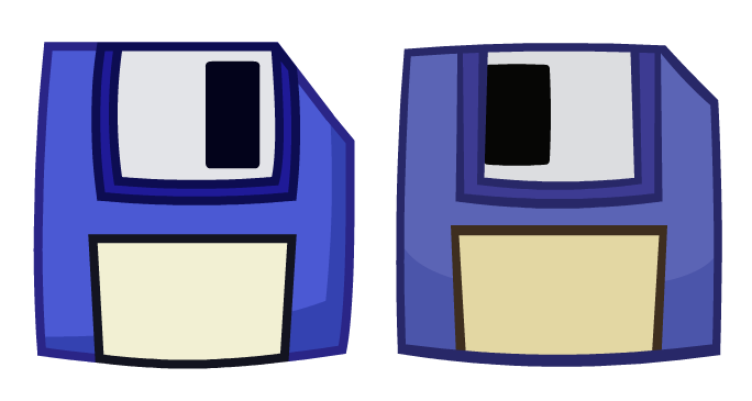
Nothing major has changed with Savey's asset, other than fixing his rather unattractive palette and some layers.

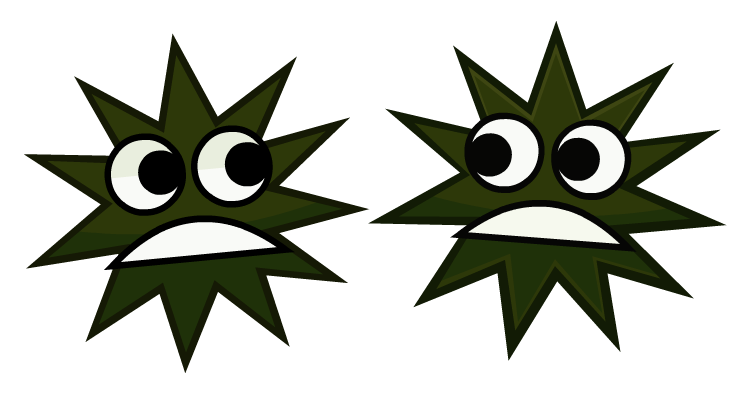
Since Malister only appeared last year, there was no asset yet, so he would have had to be created from scratch anyway. He's not much different from the hand-drawn version that was first presented for the game's third anniversary. All that was needed was to add some facial expressions.
Also there is two of him for comedy effect (=
Also there is two of him for comedy effect (=
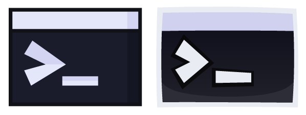
Console simply took on a more cartoonish shape, like all the other characters. No more perfectly straight boring angles.
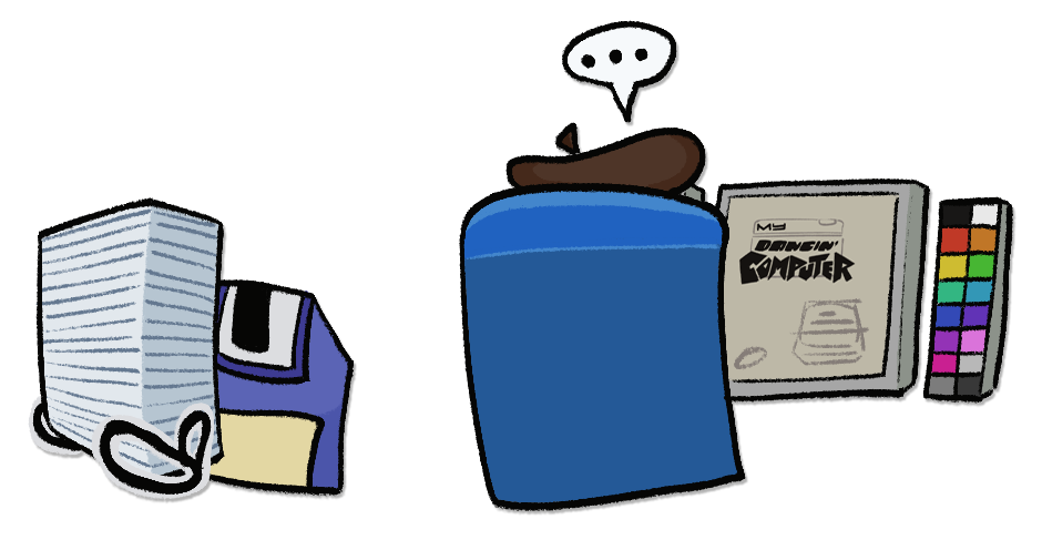
Initially devoid of any substantial asset. But procured one. Yet it remains insufficient to meet his objectives. It’s not his actual likeness.
So this was all 10 characters.
Updated logo.
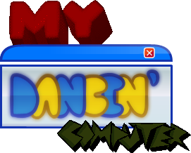
Let's all agree that the current "My Dancin' Computer" logo is totally bad designed for the game. I don't know what I was thinking when I created it. It was originally intended to be a combination of several styles – dithering 3D graphics, Frutiger Aero, and pixel art. The result was a mess, combined with the outdated Lumirium interface design.
I need a completely different approach was needed. Something dynamic.
So I started with concepts. I still wanted to retain Virusly's wit in the "COMPUTER" title, as if reflecting its essence, and the "DANCIN'" title is done in the spirit of Openly, highlighting its aero colors. I'll figure out the "MY" title as I go.
While creating the logo, I was actively searching for a font for the "DANCIN'" title. I consulted with friends about it, as I'd drawn it as a circle, and they weren't particularly happy with it. As I worked, I came up with the idea of making the "D" appear as a file and the "R" resemble a cursor.
Alas, these good design options were thrown out. I'm both sad and not particularly worried about them.
(You can click on image to zoom it)
I looked for some good Y2K font references and basically created a font for "DANCIN'".
The font for "COMPUTER" was more "hooligan-ish," more like graffiti.
The font for "COMPUTER" was more "hooligan-ish," more like graffiti.
The background object was still the Lumirium window, which was later replaced with the default Lumirium icon, and later with Belzel's screen. Thus, the "MY" title became pixelated, as if it were written in the console on Belzal's screen.
Development.
And now, finally, I'm ready to present to you the updated game logo:
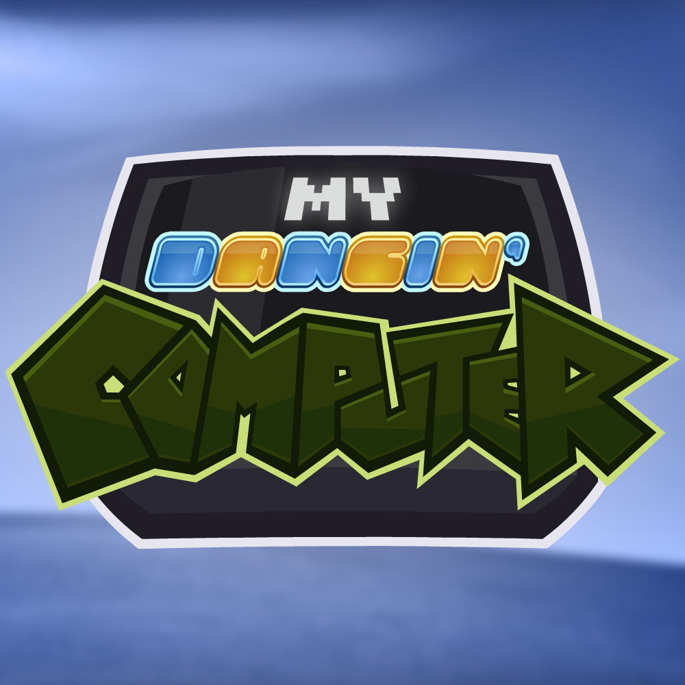
Got a big help with logo coloring from sacre_bleu. Big thanks!
For a while, I doubted the logo was really ready. Maybe there was something I could change? Or maybe I could improve it? But no, I think it's good as is.
For a while, I doubted the logo was really ready. Maybe there was something I could change? Or maybe I could improve it? But no, I think it's good as is.
A little bit about soundtrack.
I decided to take care of finding a distributor for the soundtrack in advance, and I think I've even found one, but it's probably too early to release tracks. So, for now, I'll be releasing the music on YouTube as videos. Since that's the case, I need to think about creating a new cover for the soundtrack.
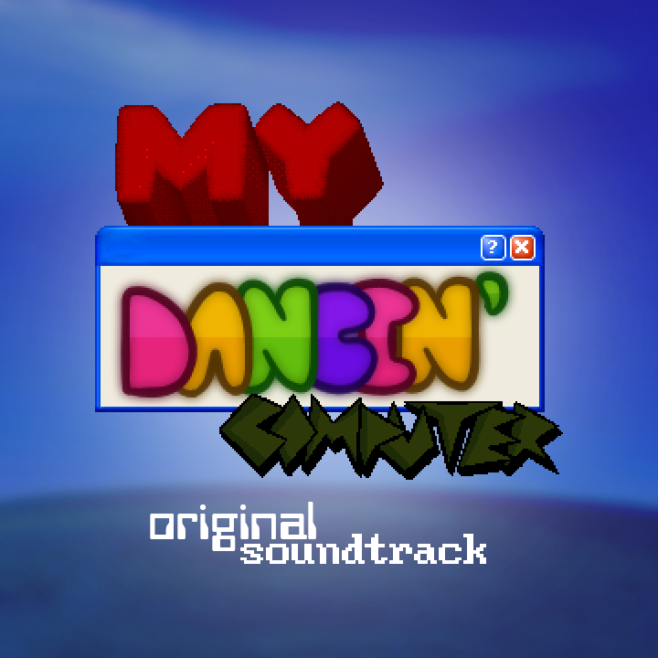
This is an old cover. I was inspired by some "Windows XP Soundtrack", but I still need to create something more original. The idea instantly came to mind: it was to make a cover in the form of a square sheet with one curved corner, like MP3sha, and a logo in the center. And within a couple of days, I had created a decent cover for the OST in Photoshop.
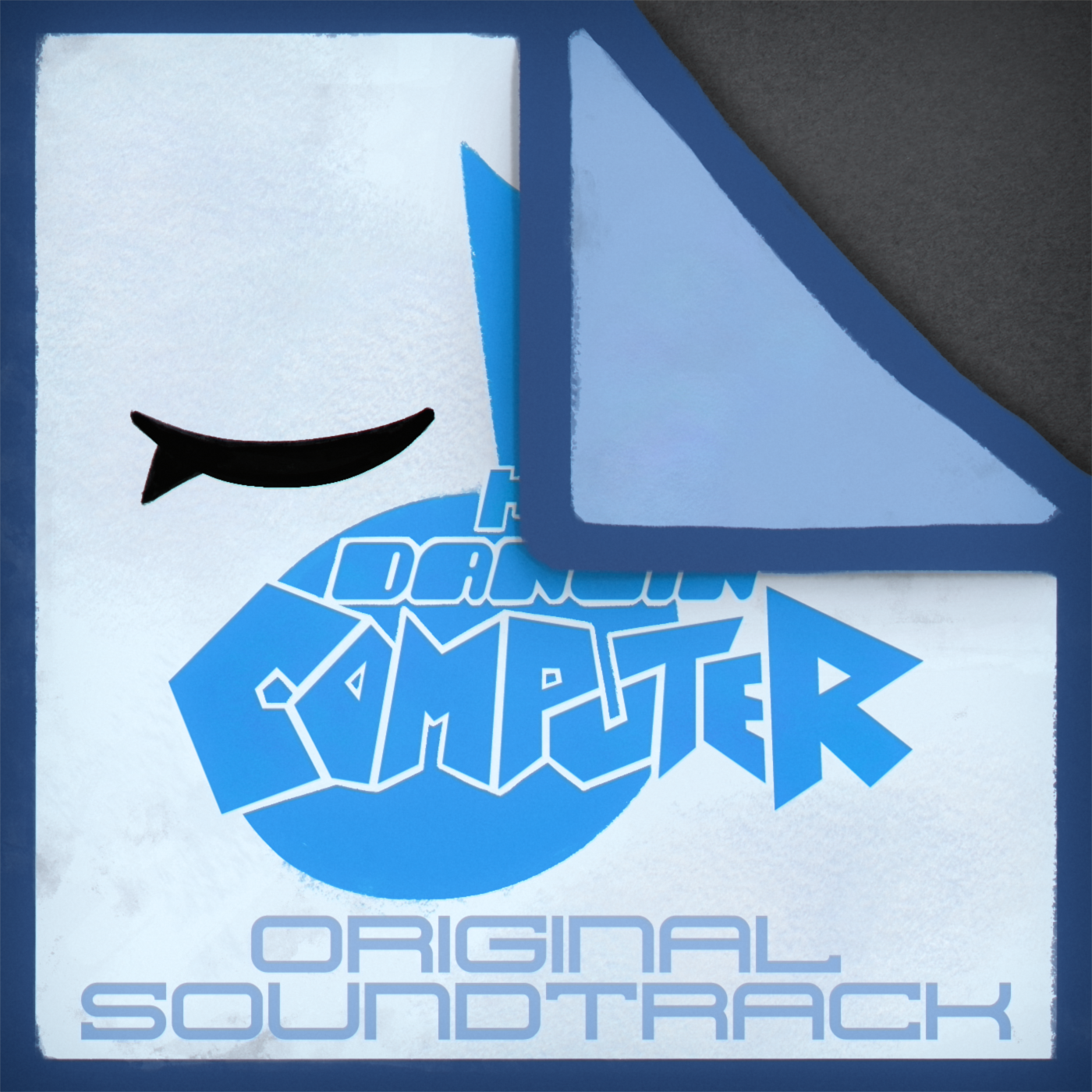
Personally, I'm very pleased with this cover.
As for the soundtrack itself, tracks will be uploaded to the channel as I deem them to be less likely to change significantly during the game's development.
As for the soundtrack itself, tracks will be uploaded to the channel as I deem them to be less likely to change significantly during the game's development.
What's up, DesignDoc??
Any well-designed large-scale game can't do without a Game Design Document. It lays out every single detail of the game. Think of it as a development tutorial that I must strictly follow. More precisely, I design the entire game in text and thoughts form. This is where the final development decisions are made, which I must weigh, consider, visualize, and maybe even create a working prototype of the intended outcome.
For example, the game will feature completely new controls. I want to keep the primary focus on cursor control, but sometimes it can't keep up with attacks, so I had to come up with something else. Keyboard controls, like modern rhythm games, could have been used, but I was afraid I'd end up creating another FNF clone. Then I figured I could use both the buttons and the mouse in a special way, and after a thorough analysis of existing rhythm games, I decided it would make sense to move the dome with WASD + diagonally, and the dome itself could only be raised and lowered by left-clicking (anywhere on the screen). I'd also use the right mouse button to close any annoying pop-ups.
I whipped up a short prototype of this new control scheme in 15 minutes and sent it to my friends for review. This decision was very well received, and I'm very happy that the control issue was resolved. But there were still a ton of technical issues to solve. That's why DesignDoc is so important for development. I simply design the game, imagining it in my head and describing the precise gameplay and other important technical information in the text. This same document also describes the game's lore and what awaits the player next after beating all levels.
But that's a whole other story.
Conclusion.
To sum things up, I'd like to say that a lot has truly happened over these three winter months. And not just with the game, but in life in general. Things change so quickly, and it's incredible how quickly time flies. I originally wanted to release a new demo this year, but given the enormous amount of paperwork, I'll only be able to complete a working prototype. After DesignDoc, I'll be studying Godot and spending hours debugging and coding.
Anyway, thanks for still sticking with me and following the news. See you in three months. Adios!
Anyway, thanks for still sticking with me and following the news. See you in three months. Adios!